
What reactive printing does to your artwork
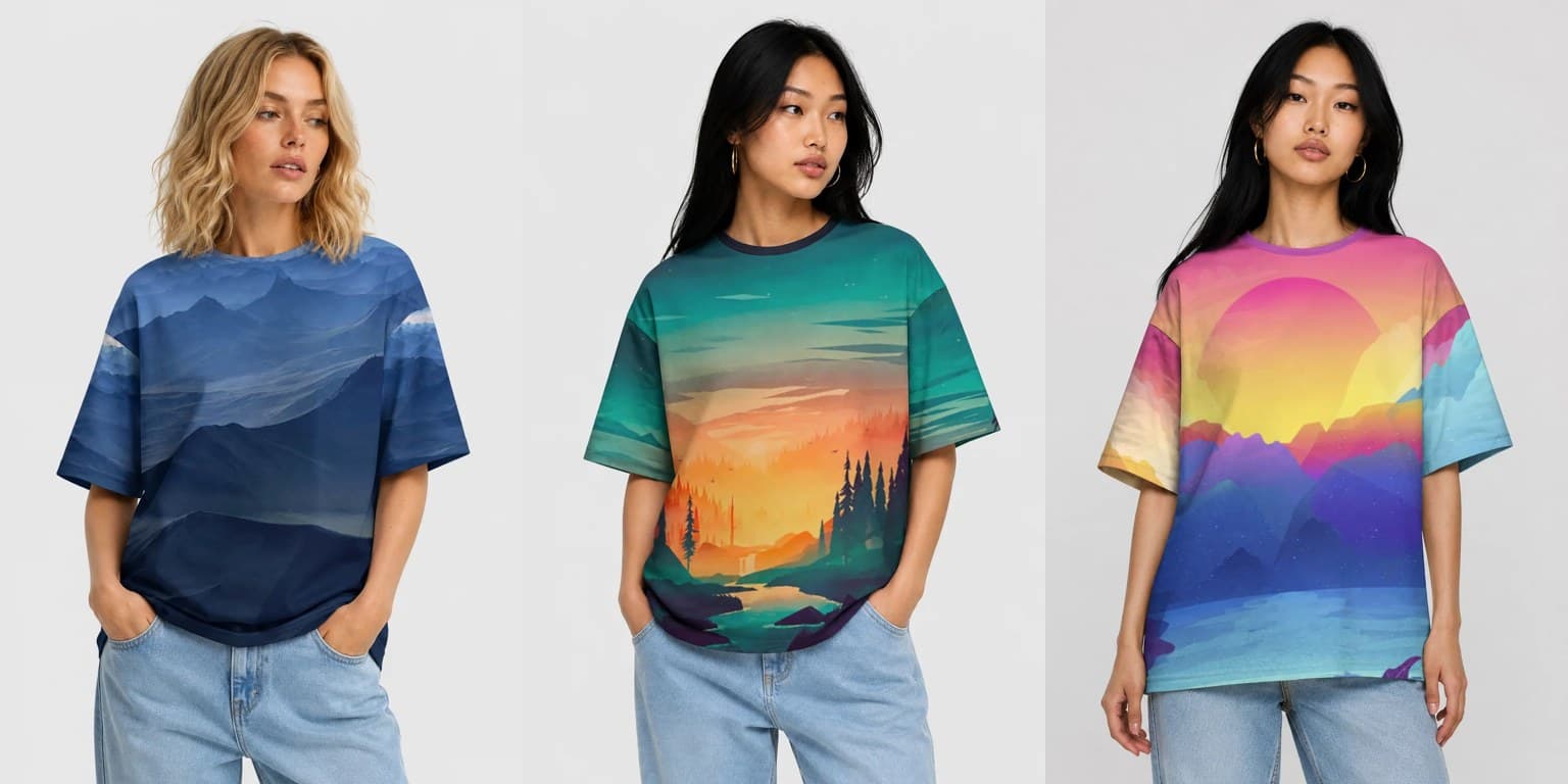
Most print-on-demand platforms never explain what happens to a file after you upload it. You send a JPEG, a shirt appears in a mockup, and the difference between the two is somebody else's problem. That works while the print is a small rectangle on the chest. It stops working when the print covers the whole garment, because then every decision you made about scale, contrast and color is visible from across a room.
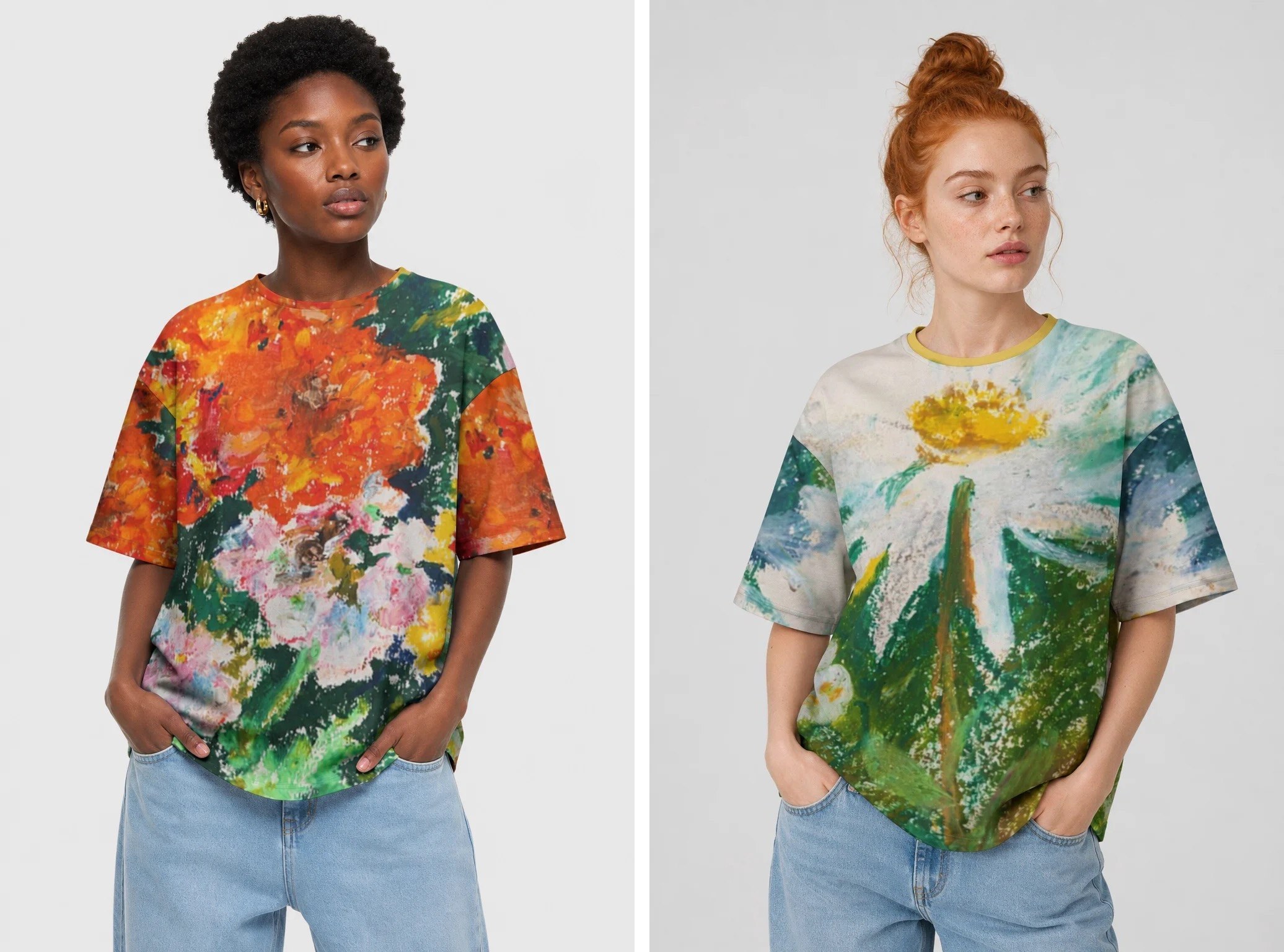
The same two paintings, worn. At this scale a single brushstroke is the width of a hand and the specks of bare paper read as light — the work is not reproduced on the shirt, it is the shirt.
This page is the explanation. It is not a style guide — nobody at allover.art will tell you what to draw. It is a description of the machine your art passes through, so that what comes out is what you intended.
The process, in one paragraph
We print with reactive dyes on 100% cotton, at our own factory. Reactive dye is not a layer that sits on top of the fabric — it forms a chemical bond with the cotton fiber itself. The color becomes part of the cloth. That is why a reactive print survives a 60°C wash while a surface print fades, and why our shirts feel like shirts rather than like shirts with a plastic patch on them.
The trade-off is that the dye can only be as bright as the fiber allows, and it cannot be opaque. Reactive dye on cotton is a transparent process. This single fact explains almost everything else on this page.
Eight colors, and why that is not a limitation
Our reactive process runs in eight colors. Not four, not thousands — eight.
Designers who hear "eight" think of the old screen-print constraint, where every extra color meant another screen, another pass, another cost, and where a photographic image was simply impossible. That is not what is happening here. The eight colors are dye channels, and they are blended and dithered in the print stage the way an inkjet blends its inks. A photograph, a watercolour wash, a gradient across the whole back of a shirt — all of these print.
What eight channels do change is which colors sit at the extremes. Neon and fluorescent tones are outside the range of any dye that bonds with cotton — they need pigments that sit on the surface, which is the process we deliberately don't use. If your artwork is built around a screaming acid green, it will print as a strong, saturated green, but not as the one glowing on your monitor.
Design in RGB. Do not convert to CMYK "for print". CMYK is a four-ink offset model; converting into it throws away exactly the saturated tones our eight-channel process can actually reproduce, and you would be discarding color before we ever see the file.
Cotton is not paper, and it is not a screen
Three practical consequences.
White is the fabric. There is no white dye. Every white in your design is the undyed cotton showing through, and every pale tint is a thin veil of dye over that cotton. This is why our prints look luminous — the light goes through the dye, bounces off the fiber and comes back out. It is also why you should stop thinking of white as a color you are applying and start thinking of it as a color you are reserving.
Dark backgrounds cost you nothing. On surface-print processes, a full-bleed black background is expensive, heavy on the hand-feel and prone to cracking. Here it is just dye. If your composition wants a deep indigo or near-black field with light forms on it, take it — that is where this process looks most unlike everything else on the market.
Fine detail survives better than fine contrast. Cotton is woven, so it has texture; a hairline at high contrast will hold, but a subtle tonal transition between two very close values can disappear into the weave. If a distinction matters to your composition, give it either a value difference or an edge.
Seam to seam changes composition
Your art is not placed on a garment. It is printed on the panels, and then the panels are cut and sewn. Which means:
- Anything crossing a seam will be interrupted. A face centered on the side seam is a face with a seam through it. Not fatal — often beautiful in a pattern — but never accidental.
- There is a safe zone, but it is smaller than your canvas. On the front print file the central 3260 × 4096 px window becomes the chest and stays whole; everything outside it feeds sleeves and sides. Faces and lettering belong in that window.
- Repeats behave differently from single images. A seamless pattern will read as an intentional textile across every size in the range. A single large motif will be scaled and positioned differently on a kids' tee than on an oversized adult one, and you should look at both.
The designs that work best on full-canvas are, in our experience, the ones that would work as fabric: they have a rhythm rather than a focal point, or they have a focal point and a field around it that still means something when cropped.
What to check before you submit
- Is the file RGB, square, and at the largest size you have? (Two accepted routes and their exact sizes are documented at file specifications — in short: front & back artwork from 1024×1024 px, or a print-ready full-garment canvas at 8114×8114 px.)
- Does the composition survive a cut through any part of it?
- Are your near-white and near-black areas distinguishable, or will they flatten?
- Does the design still read at arm's length, not just at 100% zoom?
- Does it contain anything you don't own the rights to? (See the IP documentation — this is where most rejections come from.)