
Seamless patterns: what they're for, and where they break
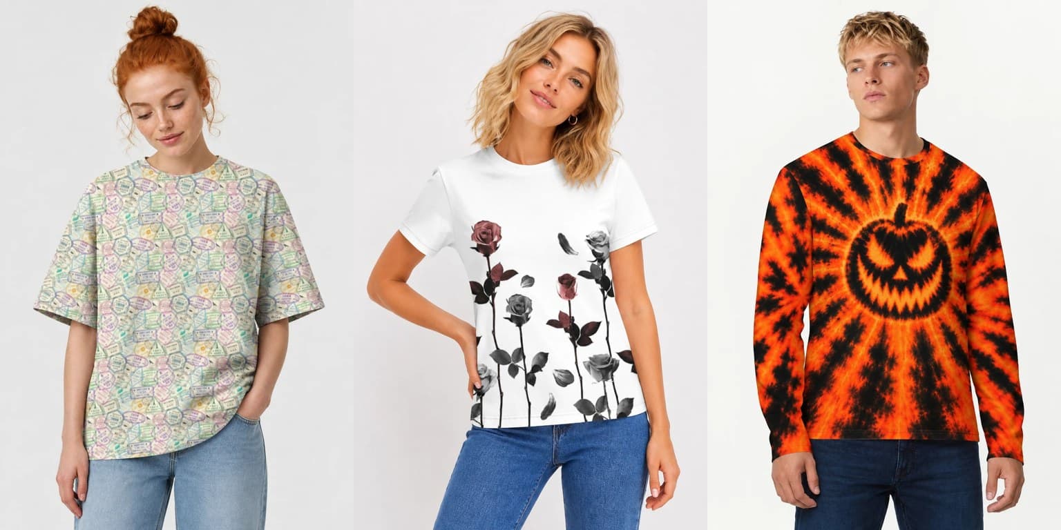
A seamless pattern is an image whose edges match: place copies side by side and the joins disappear. It is the oldest idea in textile design and the most useful single skill for full-canvas garments — and it is also where most first attempts go wrong in the same three ways.
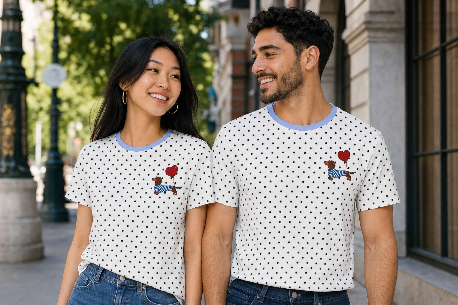
What a repeat is for. The same dot pattern on two different cuts, and nobody had to place a single dot — it fills whatever shape the panels turn out to be. This one is Polka Dot Dachshund, women's and men's.
The same pattern, tiled twice. On the left the edges do not meet and the joins draw a cross through the cloth. On the right there is nowhere to see a join — that is the whole job of a repeat.
Why patterns suit this format
A garment is not a poster. It is seen in motion, folded, from behind, partly hidden by arms, wrapped around a body that is not flat. A composition with one focal point has to survive all of that; a pattern doesn't have to, because it has structure everywhere.
There is a production reason too. On our layout, your back artwork is tiled to fill the sleeves and sides, and the front artwork sits in the center window. If your artwork tiles cleanly, those areas read as one continuous fabric. If it doesn't, every tile boundary becomes visible as a hard edge, and the shirt looks like a collage of squares.
That is the single most common failure we see: not an ugly pattern, but a good image that was never built to repeat.
The three ways they break
1. Edges that don't actually match. Obvious once said, easy to miss when working zoomed in. Check by tiling: place four copies in a 2×2 grid, zoom out, and look at the cross in the middle. Any seam that catches your eye there will be visible on the garment, multiplied.
2. Accidental grids. A motif repeated on a strict rectangular lattice produces rows and columns your eye finds instantly, even when each element is beautiful. The image stops being fabric and starts being wallpaper. Fixes: offset every other row, vary rotation and scale, and let some elements cross the tile boundary rather than sitting politely inside it.
3. Accidental clusters. The opposite problem — random placement without control produces clumps and empty patches, which read as mistakes. The old textile trick applies: place your motifs, then squint at the tiled result. Your eye will find the holes and the crowds faster than your reasoning will.
Scale, which decides everything else
A pattern that looks perfect at 100% zoom on a monitor may be either invisible or overwhelming on a body.
- Too small turns to noise at conversational distance, and competes with the weave of the cotton.
- Too large means a customer sees one and a half motifs, and the pattern stops being a pattern.
The workable rule: an element should be identifiable from across a room, and any crop of the garment should contain several. Test by viewing your tiled artwork at about 20% zoom, or by standing back from the screen.
Color: fewer is stronger
Patterns punish muddy palettes more than single images do, because the same relationships repeat everywhere. Five well-chosen colors across a garment will look designed; twenty near-identical mid-tones will look like a photo of a mess, however carefully generated.
Reactive dye rewards the discipline: dark grounds cost nothing, and light forms on a deep field are where this process looks least like anything else.
What "seamless" doesn't mean here
It does not mean the pattern will line up across a physical seam. Cutting fabric shifts things by roughly ±2%, and no honest manufacturer promises pixel-perfect alignment where two panels meet. Busy organic patterns hide that completely — which is exactly why they suit garments — while strict geometric alignment across a seam will not survive it.
Design so that continuity is a property of the pattern, not of the alignment, and the ±2% stops being a problem you ever think about.
A practical order of work
- Build the tile at high resolution, larger than you think you need.
- Tile it 2×2 and inspect the center cross.
- Zoom out to 20% and check scale and clustering.
- Reduce the palette until every color is doing work.
- Export square, at full size, and send it edge to edge.
Full canvas and layout details are at file specifications.