
Designing for a whole garment, not a rectangle
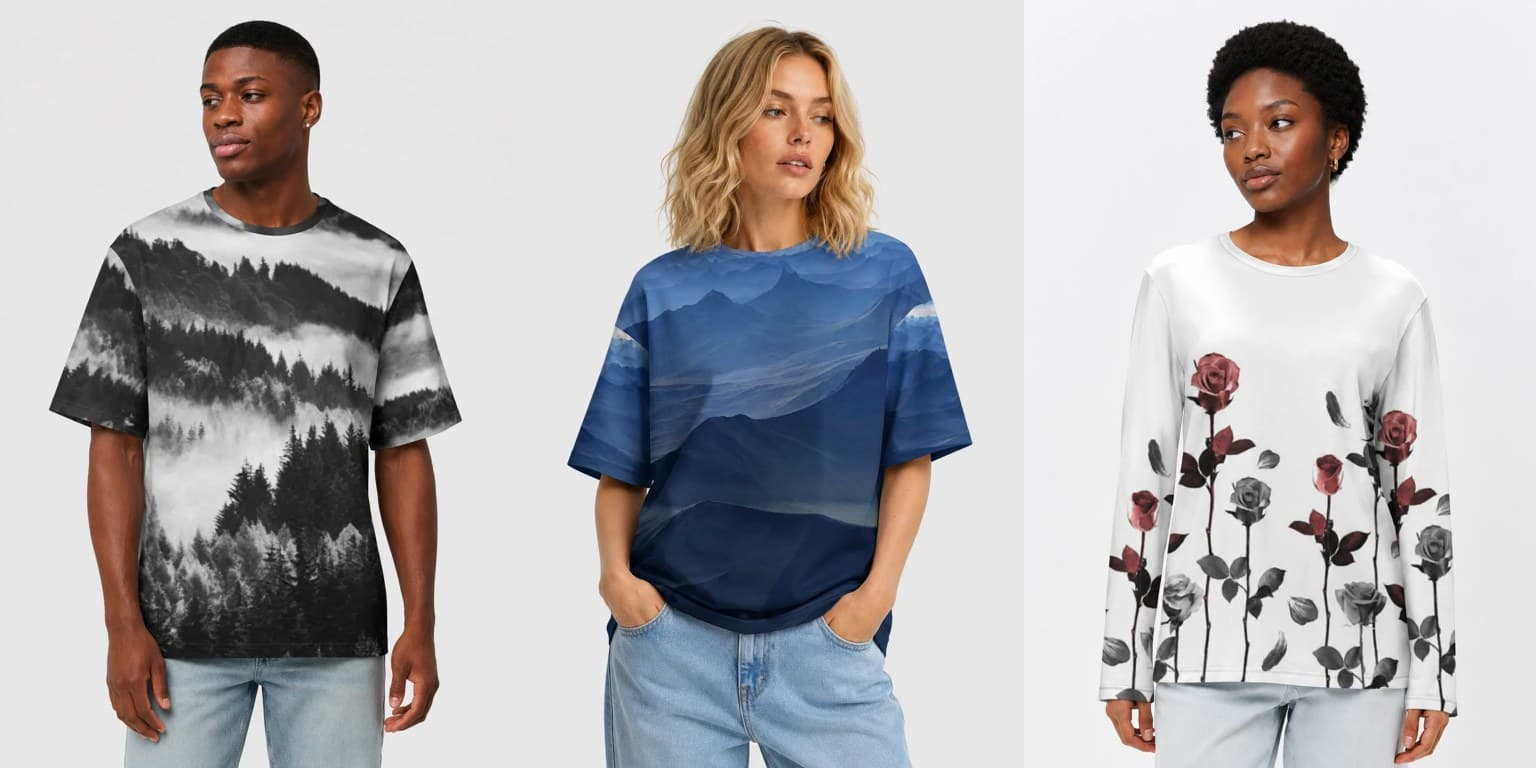
Almost every designer arriving here has spent years designing inside a rectangle: a chest print, roughly ten inches across, centered, with a T-shirt-shaped void around it. Full-canvas removes the rectangle. That sounds like freedom, and it is, but it also removes the thing that made those compositions work — a frame.
Here is what replaces it.
Rhythm beats focus
A chest print is a poster: one idea, centered, seen head-on. A full-canvas garment is a textile: it is seen in motion, folded, from behind, from three meters away, wrapped around a body that is not flat.
The designs that work are the ones with rhythm — a motif that recurs, a field that has structure everywhere rather than a single hotspot. That does not mean you cannot have a hero element. It means that if you do, the area around it has to remain interesting when the hero is hidden by an arm.
A quick test: cover any random third of your artwork with your hand. Is what remains still a design? If yes, it will work on a garment.
Scale is the most common mistake
Two failure modes, both frequent.
Too big. One face, one flower, one planet blown up to the size of a back panel. On screen it is dramatic. On a garment it reads as an accident — the customer sees a fragment of an eye and a lot of background.
Too small. A dense pattern at postage-stamp scale turns into visual noise at two meters, and worse, the weave of the cotton competes with it. Detail that is smaller than a few millimetres in print stops being detail and becomes texture.
The reliable range sits between: elements big enough to be identified from across a room, repeated often enough that any crop contains several.
There is a safe zone, and there is everything else
We print the fabric and then cut and sew the garment from it. Your file is not applied to a finished shirt; it becomes the cloth the shirt is made from. But that does not mean the layout is a lottery — it has a known geometry, and you can design against it.
On the front print file, the central 3260 × 4096 px window of the canvas becomes the chest. That is the one area guaranteed to stay whole. Faces, lettering, anything that must not be clipped goes there. Everything outside that window is tiled from your back artwork and feeds the sleeves and sides, which is what lets the front blend into the back pattern at the seams. The back file is simpler: your back artwork tiled across the panel, one continuous field.
Two consequences worth internalizing:
- Detail in the center, pattern at the edges. This is not a style preference, it is the shape of the layout.
- Seams shift by roughly ±2%. Cutting fabric is physical. Busy organic patterns hide the shift completely; precise geometric alignment across a seam will not survive it, and no one printing on real cloth can honestly promise otherwise. Treat anything within about 2% of a panel edge as bleed.
None of this is a defect to design around — cut-and-sew is why the print reaches the shoulder and the sleeve at all, which is exactly what a chest print cannot do. If you want continuity across a seam, build the artwork as a repeating field, so continuity is a property of the pattern rather than of alignment. The buyer's view of the same geometry — which designs earn those sleeves, and which read better as tees — is in our piece on the all-over print long sleeve.
The full layout anatomy — canvas sizes, tile counts, the exact window — is documented at file specifications. This page is about what to draw; that one is about what to export.
Direction, and the upside-down problem
Cloth panels are placed for yield, not for your composition's sense of gravity. A design with a strong "up" — a landscape, a horizon, standing figures — risks appearing rotated on parts of the garment.
Two safe strategies:
- Make it omnidirectional. Motifs facing several ways, or a texture with no gravity. Most successful all-over patterns are built this way, and it is not a compromise — it is what makes fabric look like fabric.
- Commit to direction and check the mockup. If the composition truly needs a horizon, look at the generated product images before publishing and confirm it lands where you meant.
Color, in one paragraph
Reactive dye on cotton is transparent and luminous, and dark fields are cheap. That combination rewards two things: deep saturated grounds with lighter forms floating on them, and palettes held to a small number of colors. Muddy mid-tones — the default output of a lot of generative work — are what make a print look like every other print. If you take one color decision seriously, make it "how few colors can carry this".
The five-minute checklist
- Cover a third of it. Still a design?
- View at 20% zoom. Do the elements still identify?
- Could a seam pass through any part of it without ruining it?
- Does it have an obvious "up"? If yes, is that deliberate?
- How many distinct colors? Could it be fewer?